Sunday, 9 May 2010
Promoting the website

Friday, 7 May 2010
Data input idea
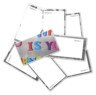
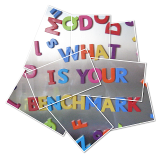
I have been thinking of various different ways for the user to input their data on the website. This is an idea that I had. The idea is that there would be an image on the website that is cut into pieces (much like a puzzle). Within these pieces features the questions that the user will have to answer. The image of the pieces are covered up by the square box which will have the questions in them. Once the user has answered the question the piece of the image will be revealed.
My 8 day energy consumption
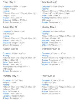
As part of an experiment I have decided to record data from the energy I use at home each day. I started off by taking photographs of the appliances that I use in the home.
Icons and colour
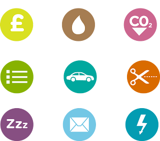
I decided to create a set of icons to apply to the site to help the use navigate around the site more easily. By using visual symbols like these ones catch the viewers eye and makes it easy for them to see what a specific element on the page is about. Also by using different colours for the icons helps the user identify each element on the page.
Testing the website
Reminder system
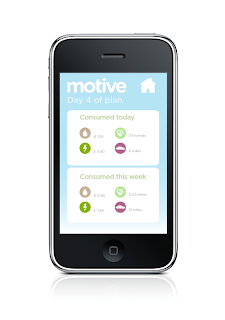
Sleep option
From my survey results I found out that people were forgetting to turn off appliances when they leave the room, or seem to be leaving them on for no reason when they are not using them. This also occured with recycling items, as people forgot to put them in the recycling bin.
My first solution to this was to design a set of stickers for people to place around the home. The stickers would have simple messages on them telling them to turn the appliances off. I thought of a new way in which this will work so that user’s don’t have to go around the house placing stickers.
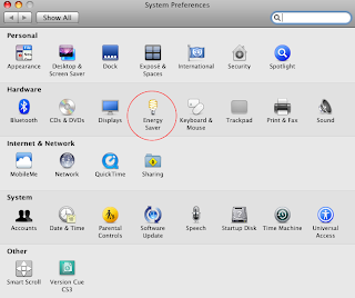
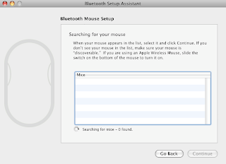
The inspiration for this idea came from a piece of ineractive design that is found on an apple mac. Users of this computer are able to set their preferences on their computer. Within these preferences features a setting that is named “energy saver”. Within this setting one can adjust a tool
bar that puts the computer to sleep when they are inactive for a cetain amount of time. This is a unique idea and as it saves energy.
So the idea that I have thought of is to use this technology to apply to my website. The idea is to have a similar setting where users can choose when they would like to put appliances in their home to sleep when they are inactive for a certian period of time. There will be a slider tthat is features on the website so that users can choose when they would like to put the appliances to sleep when they are inactive. This idea is designed to help users reach their benchmark so that they are not simply left on their own having to meet their plan.
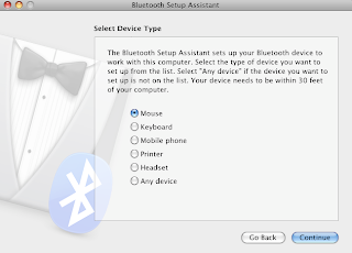
Bluetooth technology
Poke london (Website inspiration)

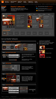
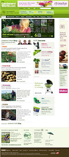
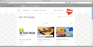
I have decided to look at some of the websites created by Poke in London, this is a web agency that produced web sites for really big clients. I wanted to see how the designs of there websites compare to the designs of my own website, so I can see what I am doing wrong or what I am doing well. These are some of the sites that I found inspiring and have learned quite a bit just by looking at them. The heirachy on each page is is really well presented as their is scale between each element that is on the page. This is something that I will be considering when designing my site.
Thursday, 6 May 2010
Carbon calculator

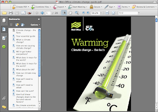
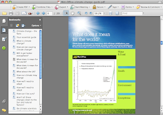
Part of my idea is to monitor how much energy people use each day at home and when they travel. I came across a new piece of design creating by actonc02.com which allows you to calculate your carbon footprint. The only problem with this piece of design is that the user has to answer a series of questions that takes quite a while to find out their carbon footprint. Also I feel that this is not a very accurate way of doing this, as it does not measure on monitor anythin in your lifestyle.
Tuesday, 4 May 2010
Self promotion
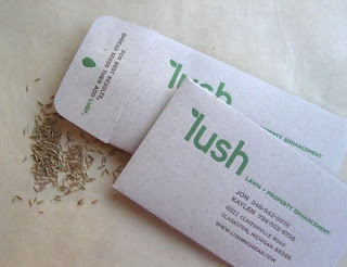
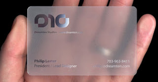
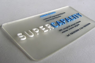
As part of this unit I am required to produce a set of materials to promote myself and my work as a designer. I have already created a website to do this, and I will also be working on creating a set of business cards to send to potential employers. I feel that promoting myself will be of great significance and a business card will be a nice piece of material to leave after an interview with a potential employer.
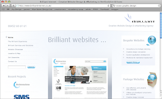
After researching to find different companies that I will be looking to get employed at, I have come across a potential web design company that looks very interesting. I like some of the work that the company produces and is exactly the type of design that I want to go into and the type of design my portfolio is based around.
Bournemouth or London?
My career path way
Poke london
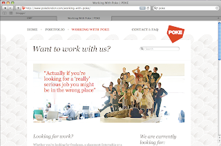
This is an award winning web agency that seeks perfection in web design. By looking at some of the websites that Poke have designed has made me realise that the hierarchy of a website is very important. I was being afraid of using large type on the page until I looked at some of the websites designed by Poke and realised that it would be fine to do so.
The problem
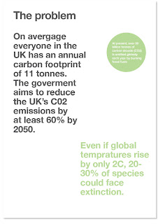

I found many statistics about how the UK is causing climate change and how we are causing carbon emissions to rise etc. But these are the statistics that I felt were relevant to my project and even gave me an idea of what to focus on. I found quite a shocking statistic that states that 40% of the UK's man made C02 emissions come from energy we use everyday, at home and when we travel. This made me think on focusing on helping people improve on this aspect of there lifestyle.
Monday, 3 May 2010
Survey results

Promoting the site


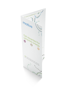
There was various different way's that I could have promoted the site. The option that I chose to promote it was by designing a brochure so that people could simply pick it up and take it away with them to read.
Inside the brochure contained all of the information that people needed to know about the brand, this tells the audience what motive does, how it works etc. The brochure was designed using the same colours and style as the website, by using the brand identity across both pieces of media.
Saturday, 24 April 2010
Final outcome

After going through countless designs, I have come to a design that I am pleased with and works well with the identity of the brand. The previous designs that I created were lacking in colour and also did not correspond to the identity of the brand, as it featured none of the colours that were used or any of the curved lines that we're used to create the typography.
Wednesday, 21 April 2010
Development
Saturday, 3 April 2010
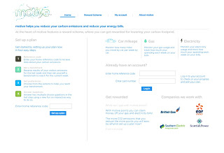
After a tutorial I realised that my the design needed changing due to the fact that it didn't relate to the identity at the introduction of the site. So I started to work on the design straight away, this led me to removing the blue background on the design which left it looking a lot more fresh. I also removed the boxes that were holding the content in them, and then just simply aligned the type that was on the page.
Friday, 19 March 2010
First logo designs
After sketching out my first designs for the logo of 'motive', I decided on one that I thought worked quite well for the brand and decided to experiment with different colours. The meaning behind the logo is that motive is a brand that is thinking ahead, this is why I chose this as a slogan. Therefore the thought bubbles demonstrate thinking ahead, which relates to the slogan of the brand.
Thursday, 18 March 2010
Tuesday, 16 March 2010
Stickers
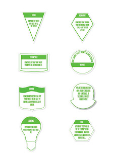
Due to my survey results I found that people were forgetting to do simple things such as turn off light switches and recycle materials in the home. So I thought of a way to solve this problem, this was to create a set of stickers for people to place around the home to remind them to do these simple things. Each sticker features a different message for different appliances that people may have in their homes.
Sunday, 14 March 2010

After spending a while getting my work up to scratch I have put together my new website www.benstrowman.co.uk, and is now online. The website showcases all of my favourite projects and the type of design that I am interested in pursuing when I graduate.
To visit the site please click here
Saturday, 13 March 2010
Final identity
I have been working on developing the idenity for the brand as I felt that the weight of the lines that I created before in the previous design were far to thick, the spacing between the lines was far to generous and also I felt that the colour of the identity needed more experimenting with. This is the final design of the identity which I am pleased with in terms of colour and also the detailing of the lines that I used.
Sunday, 7 March 2010
Naming the brand

I have been through various names for the brand and have decided on one which relates to the connotations to the brand, the name that I have chosen is 'motive'. This is because the website is all about motivating people to lower their carbon emissions and energy they use at home and when they travel.
Friday, 5 March 2010
Final outcome of the one week experiment
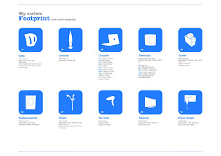
After conducting the experiment on myself for a period of 8 days, I gathered all of the data that I wrote down and visualised this by drawing the objects that I used in the home from the photographs that I took of the objects. Underneath each object features the data, including how long I used the object for, which day I used them on and also what setting I used them on.
Thursday, 4 March 2010
Identity
I wanted the viewer of the site to get an idea of what the website is all about as soon as they come to the first page of the site. After sketching out different ideas of what I could design, I thought of bringing in elements that are associated with the brand, such as cars, light bulbs etc. This would then signify to the viewer what the website is about, or at least give them some idea.
Tuesday, 2 March 2010
Technology


After thinking of my final idea on how the website will motivate people to lower their carbon emissions, I needed to see if this idea of monitoring peoples energy use would be possible. My idea was to monitor how much energy people use at home and when they travel by car, and that if the user reduces how much energy they use each week then they will be rewarded. But to do this I had to check if this was possible. Whilst researching I found some new pieces of technology that allows you to monitor how much energy you use in your home via a wireless energy monitor, and also a car mileage tracker device.
With this new technology I will be able to create a website that will monitor people energy use at home and when they travel, making the statistic that I found which states over 40% of the UK's man-made C02 emissions comes from energy we use each day at home and when we travel.
Tutorial
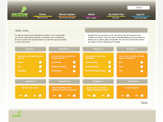
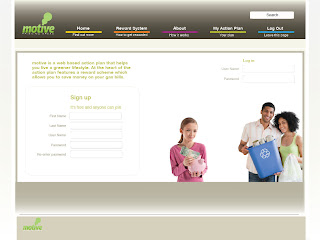
After todays tutorial I feel that the first draft designs that I have created for the website are not to the right way of going about this project.
I was told that the designs look too common and that they are quite dull, I completely agree with this feedback and intend to develop these designs further. So I now intend to start creating some sketches to plan out what is going to be featured on the pages of the site, hoe the navigation will work etc. Hopefully this will help me decide what the look and feel of the website should be too. I was expecting the first designs to be quite rough so I am The designs that I showed are featured above.
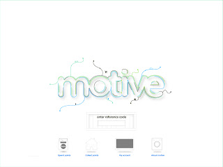 This is the first design that I have started on working on for the home page of the site after creating the final identity. I thought of drawing appliances in that we use in the home each day to use as the buttons for the user to use to navigate around the site. Then the other content on the page would be the identity and also the a box that would allow the user to enter their home reference code to receive their results.
Saturday, 27 February 2010
Presentation
The reward scheme will work by measuring how much electricity they have used compared to the week before, this will be done through their meter readings.
Tuesday, 23 February 2010
Now that I have got to the stage where I have created a few experiments, the tutorial was mainly focused on pushing me to start designing the final outcome. I am pleased with this because I have been waiting to jump in and start designing the intended solution to this problem.
Wednesday, 17 February 2010
Act on C02 (Drive 5 miles less a day)
Act on C02 Advert
Monday, 15 February 2010
Friday, 12 February 2010
- To see how much I recycle during a week and create a piece of info graphics from.
- Create an animation from the facts and figures that I have found about climate change.
- Create a system that measures how much people have done (reduced C02).
- Take the two countries that have the largest and the smallest c02 emissions and demonstrate this visually.
Tuesday, 9 February 2010
Reward system
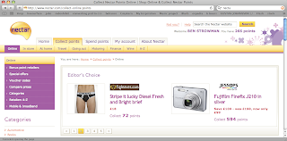
I have had a new idea to add to my project that I feel could work really well. I found that there is no incentive for people who are not too bothered about maintaing a greener lifestyle, so I have come up with idea of having a reward scheme, where by each time the person does something good for the environment that get rewarded.
Monday, 8 February 2010
Evaluation, Career Planning and Enterprise

- Review of possible destinations
- Critical reflection and developing a profile sympathetic to a chosen destination
- Documenting practice in level 6 with particular emphasis on the Major Project
Critically reviewing and monitoring suitability of ‘portfolio’
Sunday, 7 February 2010
Friday, 5 February 2010
- The idea is sound and achievable.
- Does it need to be a website, if not what else could it be?
- What is the first experiment that I will decide to do this week?
- Could you make it some new product that nobody has got?
Tuesday, 2 February 2010
Synopsis of study
There are two ideas that I feel could work really well to focus on for my EMP, and I have found myself stuck between choosing which one. The first idea was to create an action plan application that would encourage people to maintain a more sustainable lifestyle, the second idea that I had in mind was to create a signage system for an environment such as a hospital or an airport where it is hard to navigate for certain people.
Below is the idea that I decided to choose in more detail: (Synopsis of study)
The current climate of today’s society is known to have a large green issue, this project aims to help to improve this issue by creating a website where people are able to understand how to maintain a more sustainable lifestyle. The website features an action plan application, this application will give people a useful tool to calculate a tangible value of their actions. The action plan application allows users to choose a prioritised to do list of realistic actions to shift them to a more sustainable lifestyle.
This site will encourage people to make a big difference to the world in which we live in. The system allows users to choose a plan that suites them best, and then customize this action plan to suit their needs, this will be focused on aspects such as expenditure. The website will be aimed at the average man and woman who are unsure about how to live a more sustainable lifestyle.
As well as creating a website I intend to create a set of promotional materials to promote the site, this will involve creating an advertising campaign and also materials to remind people to do the little things in life that have huge impact on our society, such as simple things like turning the lights off on their way out. I also intend to create a name and identity for the website.
The research for this project will involve looking at how to improve our impact on the world and how people can maintain a more sustainable lifestyle. The reason to why I have chosen this idea for this project is because I am interested in helping to improve the world in which we live in, especially because of the condition of the current climate. As a designer I feel that I should be thinking of different concepts to help improve the world, and I feel that this concept will achieve this. I also feel that this project will help me to develop a stronger breath of work to my portfolio and will also improve my chances of getting a job in the area of design that I am interested in.
Thursday, 28 January 2010
Portfolio tutorial
Tuesday, 26 January 2010
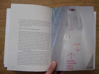
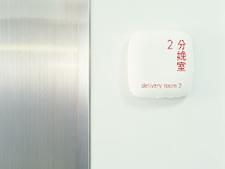
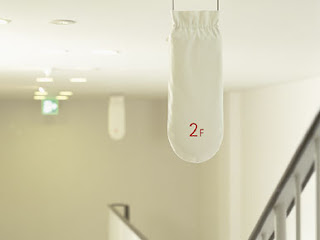
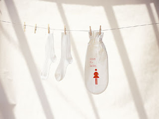
Kenya Hara (Umeda Clinic Signage System)

